
Madwell
2022
ROLE
Creative development, brand guidelines, website, animation
Historically, Madwell’s brand identity has lived in the heads of a collective few. During the summer of 2022, we decided to change that. We embarked on a brand refresh that would reflect the agency’s values, provide a level of specificity for designers to replicate across media and time, and to codify the visual standards to ensure the brand’s integrity.

Defining a graphic concept
Part of the reason Madwell’s brand was so hard to pin down is because it lacked a conceptual north star. If we were going to build a brand that would last 10 years, we had to define a graphic concept that all our work would reflect, even as trends came and went.
Madwell puts the madness of creativity, the unexpected, and the unpredictable to work. They do it with discipline and they do it well. Madwell’s graphic system should represent madness and discipline equally, to signal that they’re stronger together.
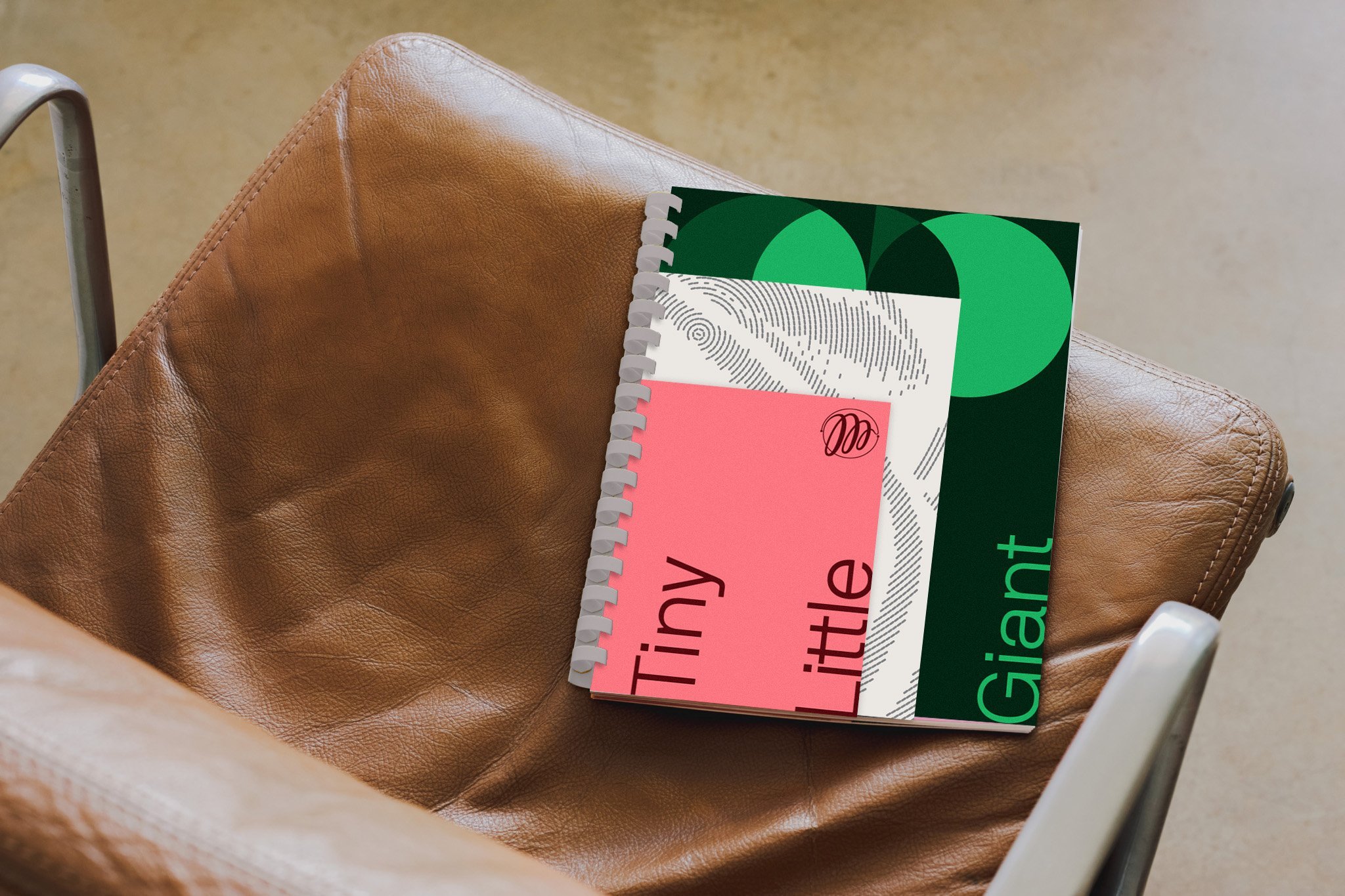
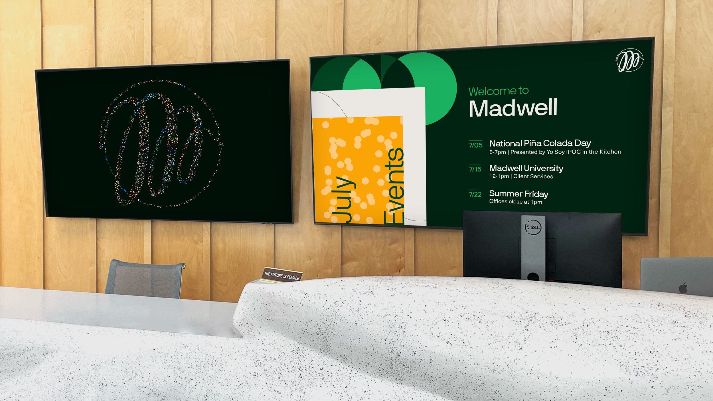
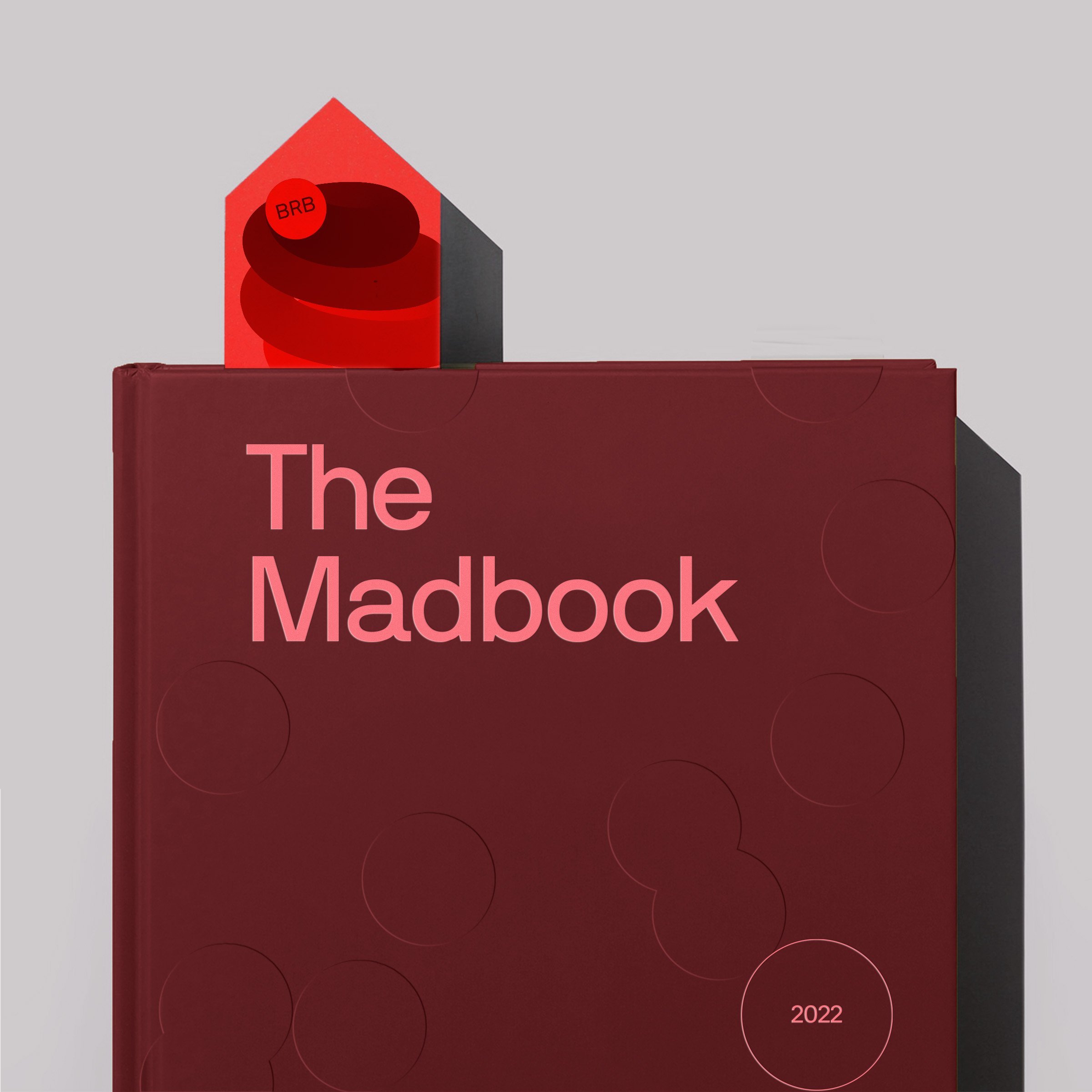
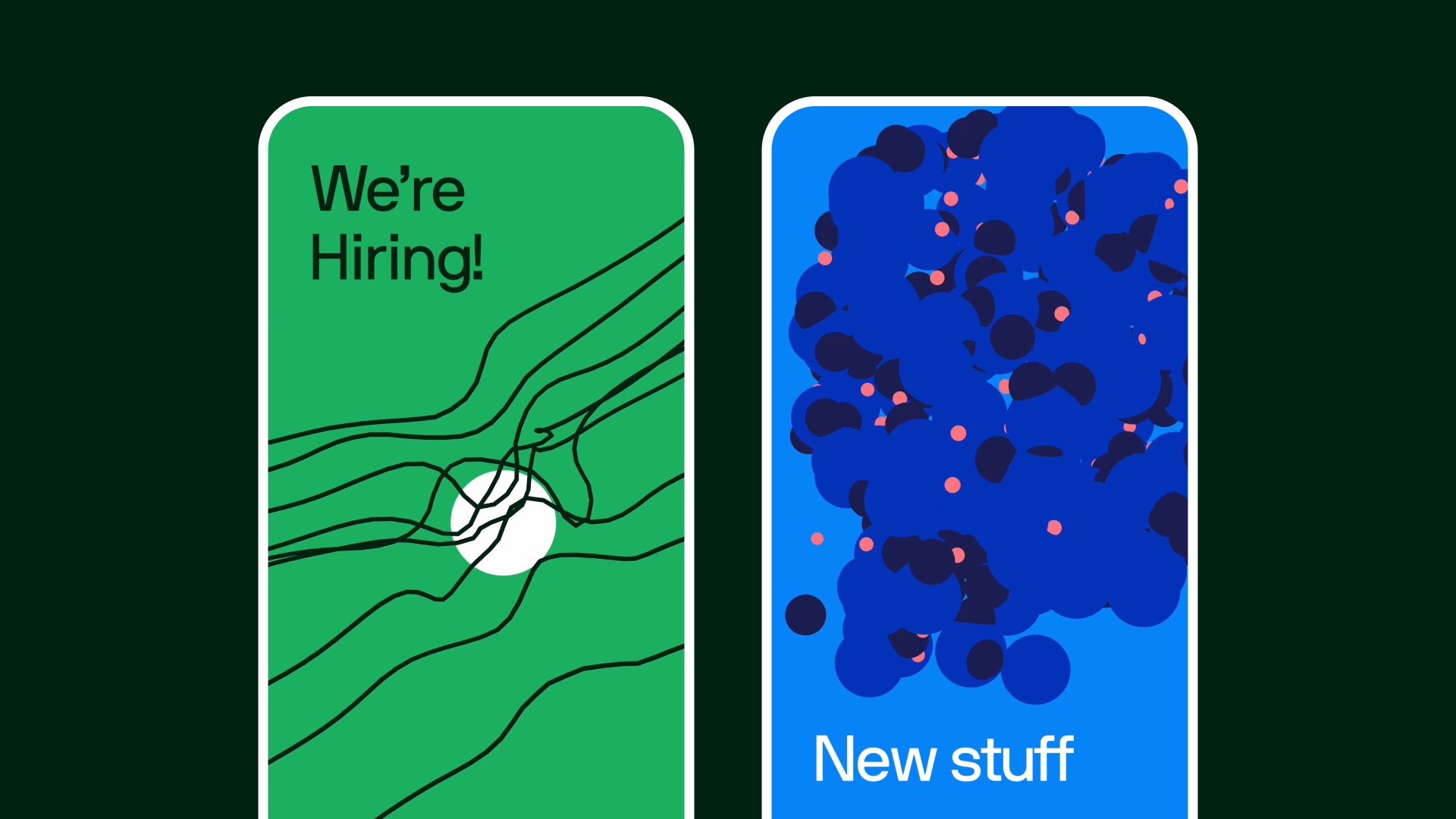
The Graphic Concept
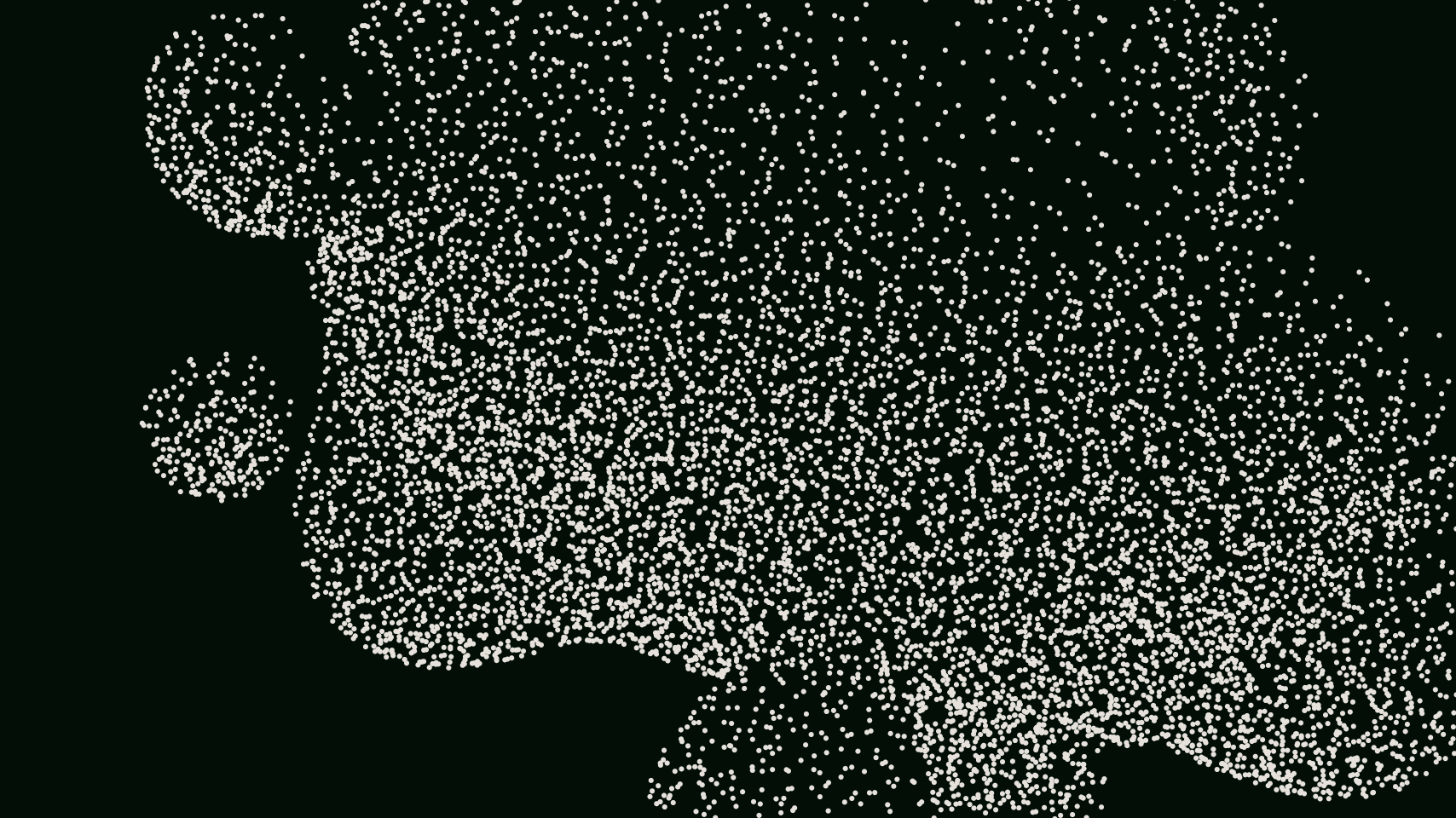
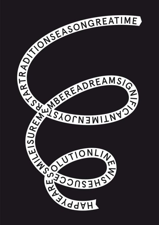
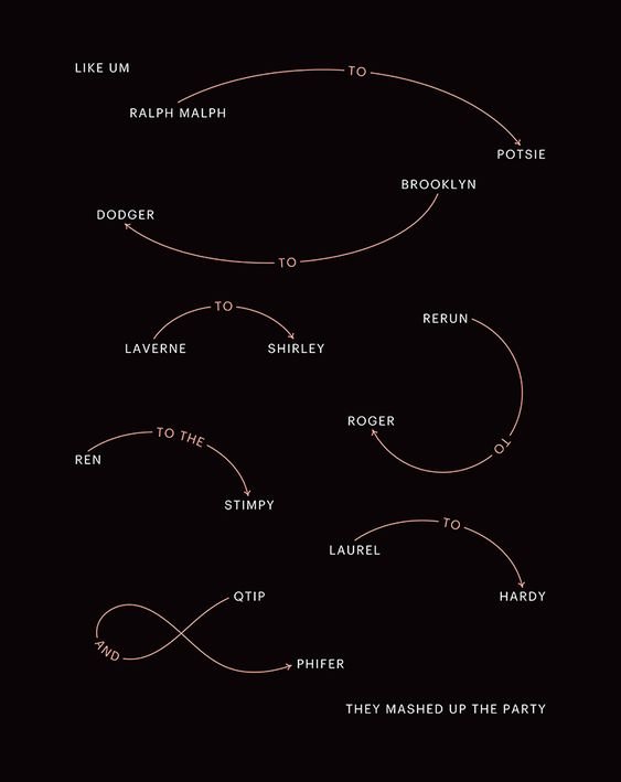
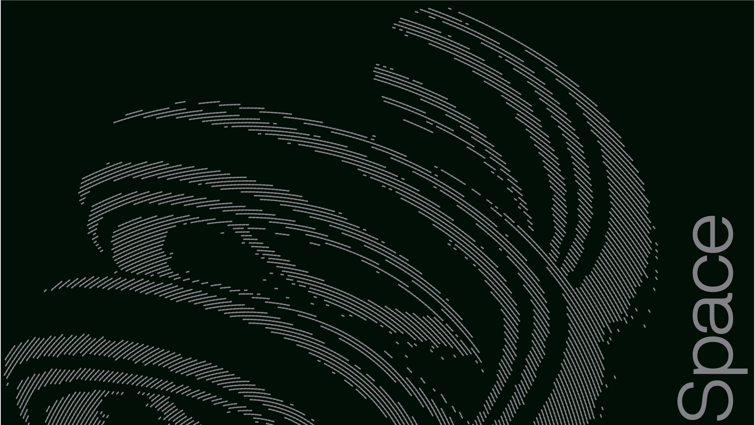
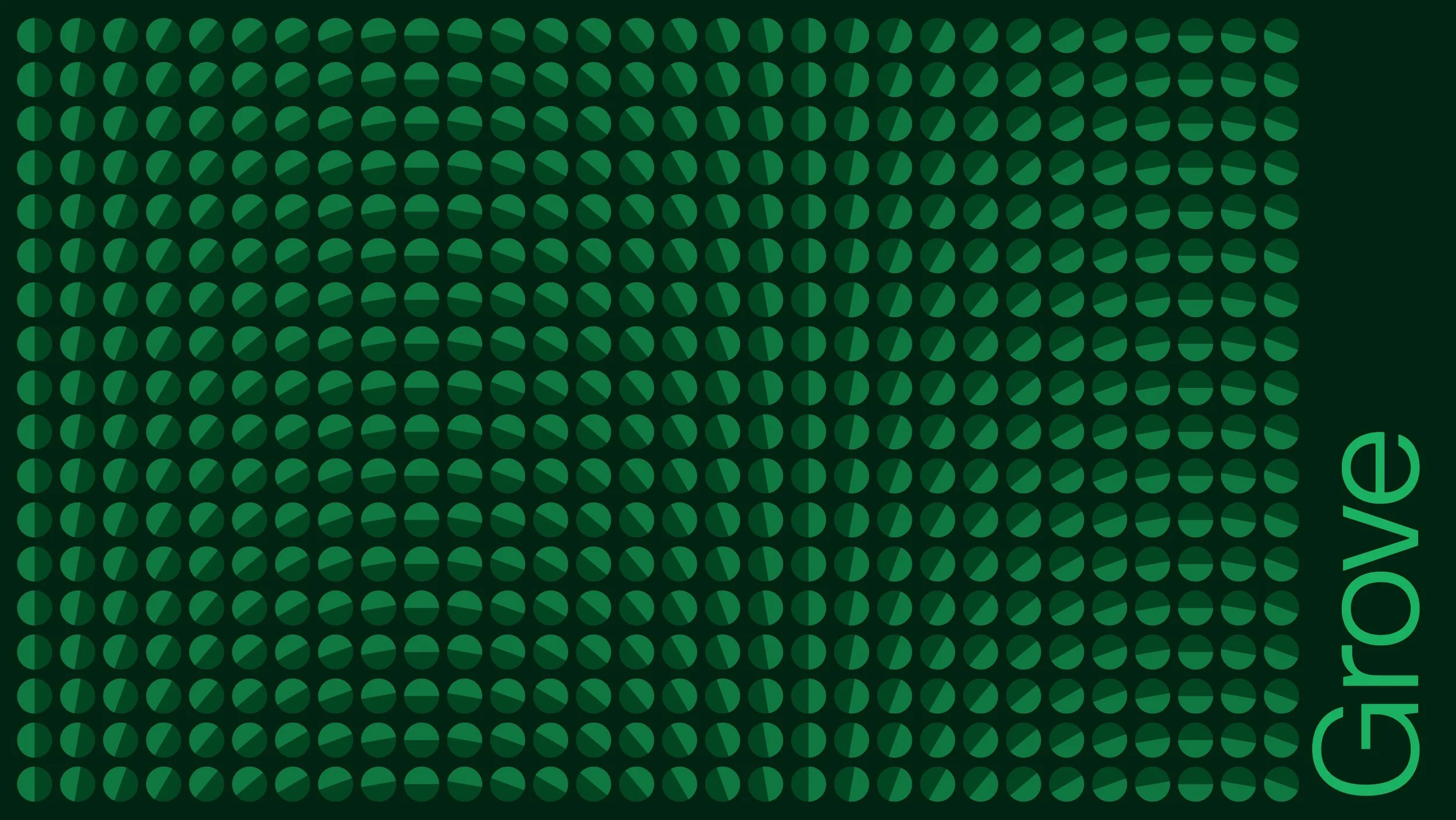
Our flexible system is designed to represent the space we occupy between discipline and madness. Our system consists of two basic elements: the dot and the line.

THE DOT
The dot, in static form, represents original perfection and speaks to Madwell’s affinity for polished, high quality work.
THE LINE
As artist Paul Klee once said, “A line is a dot that went for a walk.” To Madwell, the line represents creativity, and the chaos that may ensue in pursuit of truly original, out-of-the-box thinking.
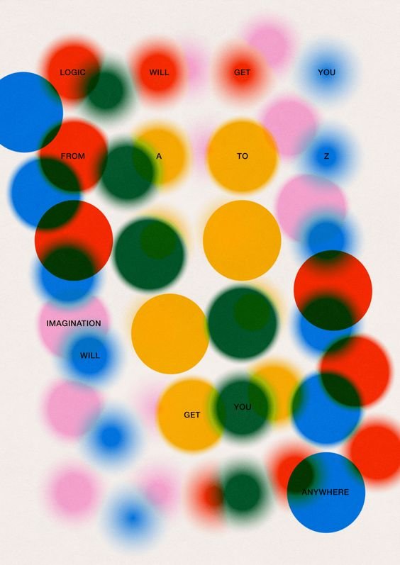
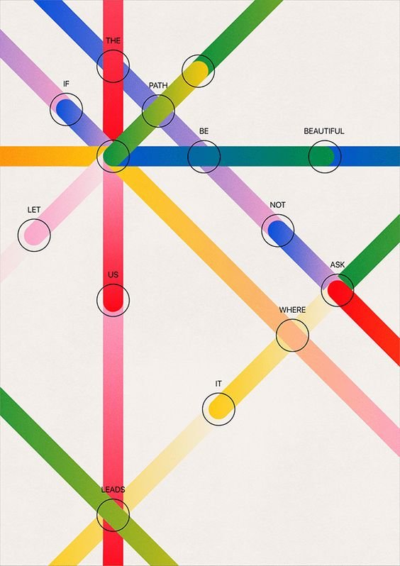
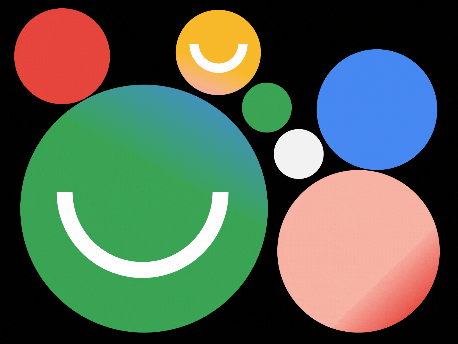
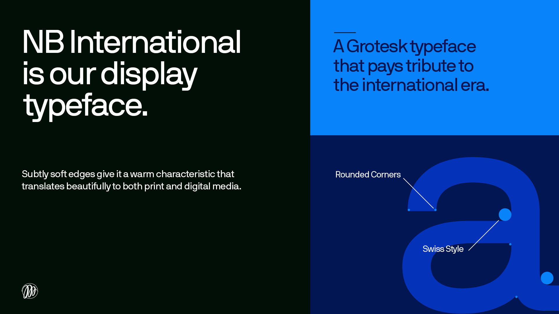
Type & Color


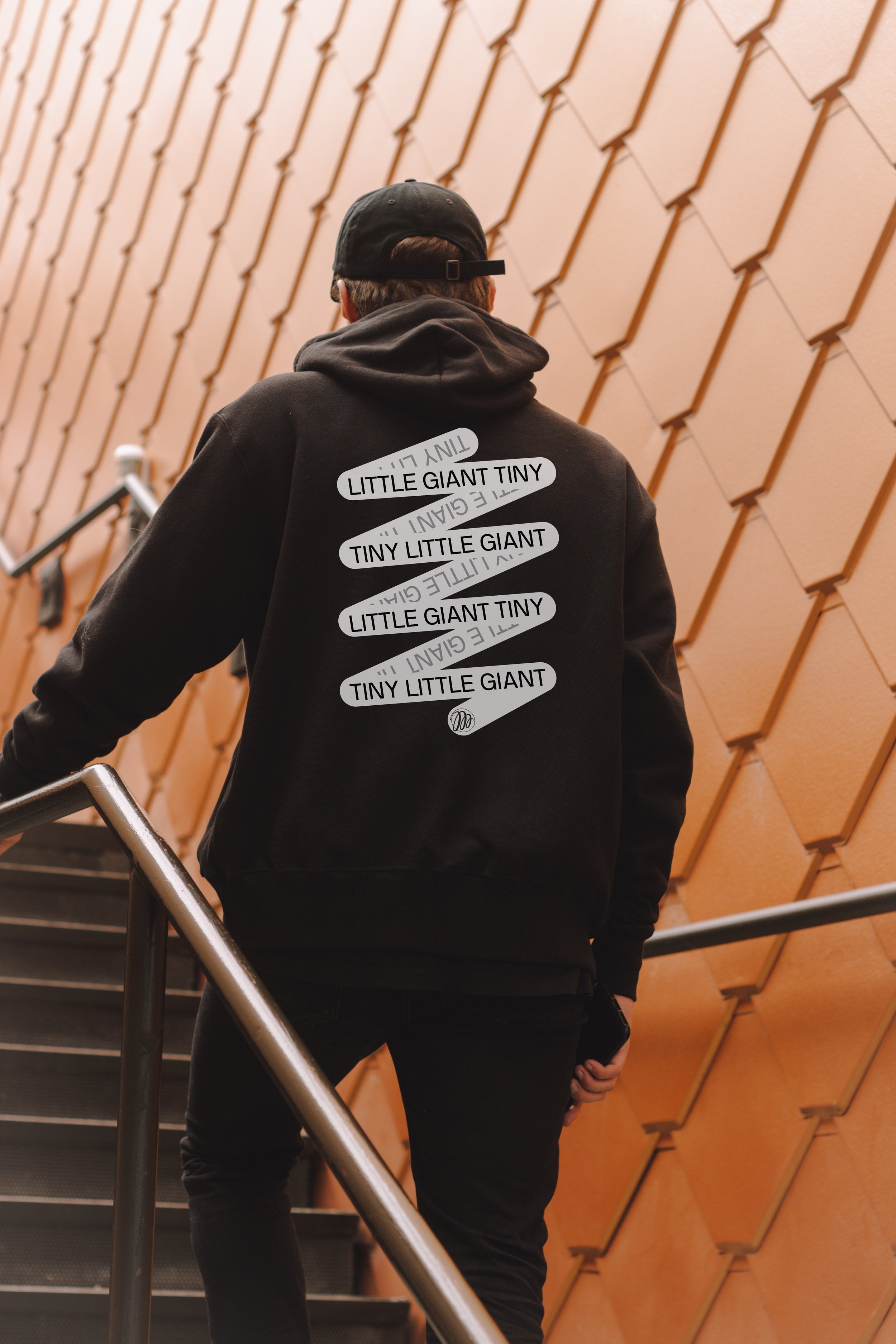
Brand Execution


Brand Guidelines


